Statistics for PMs - Sample Ratio mismatch
Sample ratio mismatch happens when specific subgroup is overrepresented in test variant and under-represented in control variant
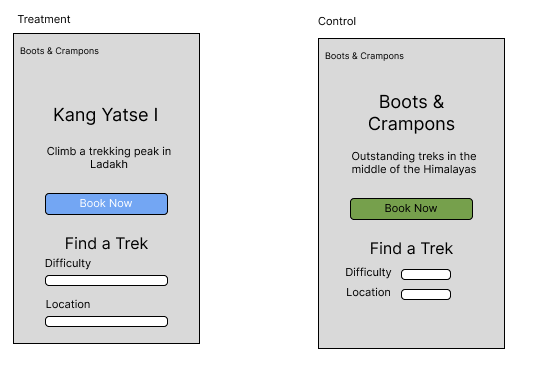
The Experiment: New Home page design for Trekking website
You are building a Trekking website. Your goal is that customers come to your platform, they browse through the many treks, they express interest in staying up-to-date with all your treks. There is a CTA to receive emails from your company.
And most importantly, they signup for and book a trek with your company.
You are launching an experiment, where you are updating the landing page of your trekking website, with the goal being to boost conversions
Audience coming to your platform:
Let’s say, Boots & Crampons are getting 50,000 visitors to their trekking website on a monthly basis.
Being an India-focused company, Boots and Crampons gets about 80% of all traffic from India.
There is also traffic coming from outside India - let’s say:
- 10% is coming from North America (US & Canada),
- 5% is coming from Europe, and
- 5% from Rest-of-the-world.
Key Metric targeted:
Impact metric: Number of trek bookings.
Current: Number of trek bookings in May ’24 , from 50,000 visitors was 500 - a fairly healthy 1%.
Target: We want to see an increase from 1% to 1.5% in Trek bookings.
Your goal is to run this test over a 1-month long period.
Designing the test:
Ratio across Control & treatment:
You have a fair amount of confidence in the new landing page’s ability to convert your users. You’ve hired a very promising designer to create this new page for you.
Given your high intuitive confidence, you decide to serve 50% of your users with this new landing page, for the entirety of June ‘24
Hypothesis :
Null hypothesis - The number of conversions amongst users coming to your platform will be the same, regardless of the home page design being viewed.
Alternative hypothesis - The newer landing page results in increased conversions. As mentioned above, we are expecting an increase from 1% to 1.5% in Trek Bookings.

Running the test:
You decide to run this test for the entirety of June ‘24.
You configure your optimization platform - Optimizely/ VWO to do 50-50 split testing.
Being a truly randomized trial, this means that effectivelly all segments will have 50-50 split. 50% of users in the US will be getting Website version A, and another 50% will be getting Website Version B.
That means:
Of the 100 teenagers in the US, 50 +_ will see Version A, whereas 50 +_ will see Version B.
Of the 200 people in the US who are in the age group of 40-50, 100 +_5 should see Version A 100 +_5 should see Version B
And that’s how it should be across customer segments
Sample Ratio Mismatch creeps in
The website did well in June ‘24 - there was a 20% boost in traffic on the back of major optimisation efforts you’ve put in.
The new traffic is 60,000 users in June.
As per your test design, you should have had 30,000 users each across Control and Treatment.
But when you go and observe, you find that 40,000 users were served Control, and 20,000 were served treatment.
You are annoyed at this, but you shrug and figure that 20,000 is still a good number to do an analysis. And in principle, it certainly is.
And the data you get is: Control: 40,000 visits, 420 conversions - 1.05% Treatment: 20,000 visits, 180 conversions - 0.9%
However Sample ratio mismatch is dangerous here because it affects different customer segments differently. For example Caching - let’s say your website is cached very aggressively in Tier-1 cities in Delhi & Mumbai in India. And these happen to be the places where you get more bookings.
So more users in Delhi & Mumbai are seeing Control. And it is because of that fact that Control is outperforming Treatment. The customer segment that is more likely to do bookings is over-represented in Control group!